
Web Application Basics
Introduction
This article will introduce the basics of the web application and terminology used throughout this Help Portal. It is a good place to start to learn where to find what.
Site Layout
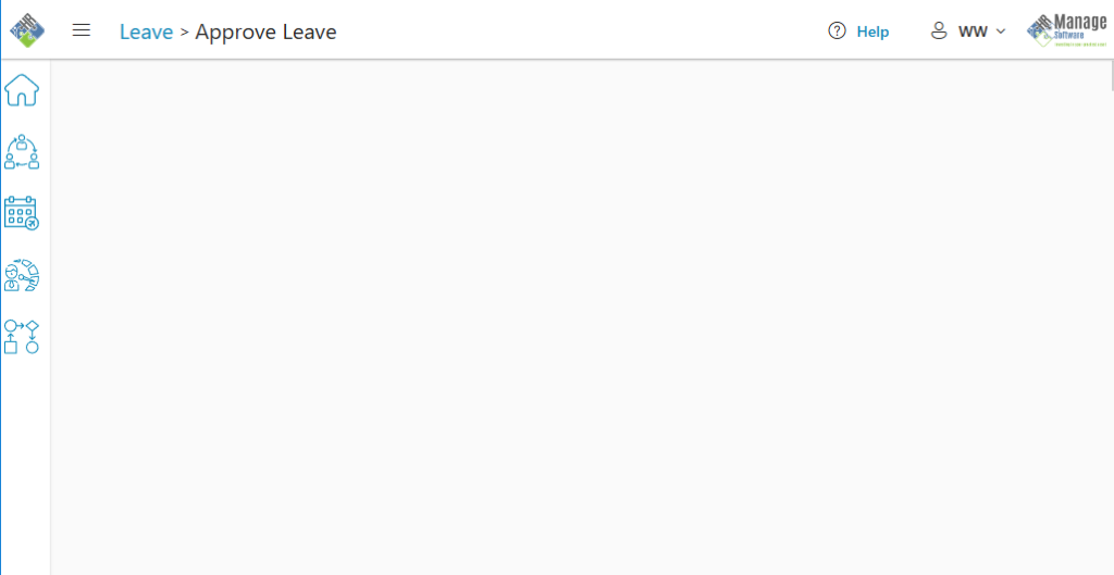
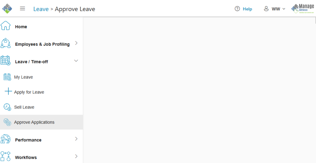
Every page of the web application consists of 3 main sections:
- The Top Header / Navigation Pane
- The Left Menubar
- The content / work area
Navigation Pane
The navigation pane / header is the bar at the very top of every page and it contains the following elements:
- HR Manage Logo: Clicking on this will take you to the main landing / home page.
- Site Menu Button: This button looks like 3 horizontal bars (also known as a “burger menu”). Clicking this button will expand the menu pane on the left or collapse / minimize it if already expanded.
- Sitemap: This will display the parent pages and page that is currently open. You can click on the parent pages to navigate to the parent record or module.
- Help: You can click the Help button on any page and the Online Help Portal will open, providing help for the specific page that you’re on. If help is unavailable, the Help button will not be enabled / visible.
- User: The button will contain the first initial of the logged in user and the first letter of their surname. Clicking on the dropdown will allow you to open your user profile (where you can change your username / password) or you can sign out.
- Company Logo: Your company’s logo will be displayed in the top-right corner.
Site Menu
The site menu provides the main mechanism for navigating the HR Manage Online application. Clicking on any module while collapsed, or clicking on the Site Menu Button, will open the menu pane. The menu is divided into modules that can be expanded / collapsed and the menu items under each module can be clicked to open the page.
For convenience, it is possible to right-click a menu item and open it in a new tab.
Working with Lists
HR Manage use lists in a variety of ways throughout the system and it is useful to know how to use it properly to get the most out of the functionality.
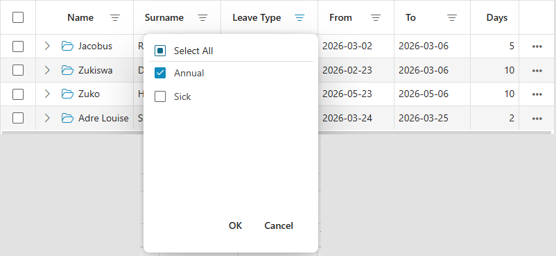
Lists can consist of the following elements:
- Columns: Every list will consist of one or more columns. Depending on the priority of a column, for smaller screens, lower priority columns might get hidden and can be viewed for each row by clicking on the ellipsis button on the far right of the row.
- Filtering: The three lines next to each column indicates that the column can be filtered by clicking on that button. This will open a popup to specify the filter and the exact content of the popup will depend on the type of column being filtered (string / number / date). If a filter is applied for a column, the colour of the filter button will change to the accent colour.
- Sorting: Clicking anywhere else on the column header (thus not on the Filter button), will sort the contents of the list according to the column header that was clicked. After sorting, an arrow will appear in the column header to indicate that the column has been sorted. Clicking on the column header again, will sort it in descending order.
- Checkbox: If multiple selection is enabled / allowed, a checkbox would appear in the far-left column. There will usually be a toolbar associated with the list for specifying what action to perform on the selected items.
- Expander: In some cases, a row in the list might contain additional information or editable fields or actions. These can be viewed by clicking on the Expand icon which sits on the far-left of each row (it looks like a right-arrow with a missing horizontal line). Clicking it will reveal the additional details and the icon will change to a Collapse icon (which looks like a down arrow without a vertical line).
- Open icon: If the record can be opened on a full page of its own, an Open icon will be visible in the first data column of the list. For convenience, this icon can also be right-clicked so that the record can be opened in a new tab.
Typography
HR Manage Online uses various elements, font styles and colours to provide users with additional subtle information.
- Links are usually in blue text and sometime underlined. They can be clicked to navigate to another section on the page or to a different page.
- Tooltip Items are text that has been underlined with a dotted line. You can learn more information about the text or the data it represents by hovering the mouse cursor over the text which will display more detailed information in a tooltip. These are usually found in cards and lists with status columns where the tooltip will provide more information about the current status.
- Buttons are usually text (optionally with an image) that contains an outline. They can be clicked to perform the action as described by the button’s text.
- Green text indicates that the text or value represents something successful or positive. Examples would be a notification that a record was successfully updated or that a leave balance is positive. For buttons, it could represent positive actions like saving, approving or creating.
- Orange text indicates that the text or value represents something like a warning or an indirect deduction.
- Red text usually indicates that the text or value represents an error or negative value (like a negative balance or non-compliance or expired value). For buttons, it would represent a “negative” action like deleting, rejecting or cancellation.
- Gray text usually provides some additional context or information for the text / value before it.